Results
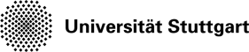
The work package “interactive visualization” is aimed at displaying different data dimensions of multi-attribute fields. A combination of methods of information visualization and scientific visualization lends itself for the visual analysis of such data. From a information visualization point of view, scatterplots and parallel coordinates are established and effective methods for multidimensional data. So far, these methods were only available for discrete data, i.e. discrete data points without a space-reconstruction model for data points which are not given in the original data set. In contrast, simulation and aggregation results within the SFB (and in scientific and engineering simulations in general) are based on a continuous computational space which is used to reconstruct data at any given location in the data set. For this reason, traditional methods which are based on scatterplots and parallel coordinates are not consistent with their underlying data model. Therefore, the concept of scatterplots and parallel coordinates was modified in such a way, that continuous data sets can be visualized. An example of a continuous scatterplot can be seen in Fig. 1.
|
|
For continuous scatterplots, not only the original discrete data is used, as it is the case in traditional scatterplots, but additionally, data is interpolated between grid points. A continuous scatterplot does not show discrete data as points or glyphs. Instead, the density of the data is computed at each location and mapped to a color value. The accompanying new mathematic model is the core of this publication. However, the numeric realization used in this work has the disadvantage of only allowing linear interpolation for data reconstruction. Therefore, a follow-up approach was developed which removes the limitation of linear interpolation and accelerates the computation of continuous scatterplots. This advanced approach uses an adaptive approach which does not compute the density directly, but approximates it by subdivision. The user can decide gradually between high visual quality and fast computation. An explicit control of the approximation error is granted, and due to the adaptivity, this approach scales well for large data sets. In contrast to the original approach, an arbitrary interpolation or reconstruction method can be used. This avoids reconstruction artifacts and leads to a visualization which is consistent with the reconstruction method used in the simulation of the data set. In addition, it is possible to use an efficient hierarchical data structure.
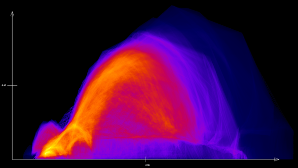
As an alternative to the hierarchical approach, a parallel implementation for GPUs was created with CUDA (Compute Unified Device Architecture; a language for the efficient execution of non-graphical computations on the GPU created by NVIDIA). This approach accelerates the original method substantially making it available for large data sets. In addition, continuous scatterplots were combined with typical scientific visualizations in multiple coordinated views and make use of brushing and linking (an example is shown in Fig. 2). Brushing allows to select relevant data features in the scatterplot by graphical interaction (using the mouse) and Linking transfers this selection automatically to a corresponding selection in the connected volume renderer.
|
|
Scatterplots are a great means to analyze two dimensions of a data set. However, if a data set contains more than two dimensions, several scatterplots have to be created and combined in a scatterplot matrix. Unfortunately, this visual representation is confusing and a coherent analysis of several dimensions is not possible. This limitation can be avoided by using parallel coordinates. So far, parallel coordinates were only available for discrete data sets; therefore we extended the underlying approach to continuous data using the same idea as for continuous scatterplots. In this case, the discrete lines of the parallel coordinates are advanced to a model of line densities. In addition, several alternative computational approaches are presented for continuous parallel coordinates.
|
|
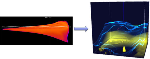
Network visualizations are commonly used to analyze relations between objects. One of the two common visualization approaches is the use of node-link diagrams that allow an easy navigation through the graph. At the same time these representations suffer from overdrawn for large graphs, i.e., graphs with a high number of vertices and a high density of edges, because of many edge crossings. By applying clustering and aggregation methods to node-link diagram, we can improve the scalability, i.e., we can perform multi-scale visualization on networks. In particular, our approach supports the fuzzy clustering of graphs so that objects can be allocated to different communities with different extent. Therefore, the structure of the network aggregation hierarchy is very flexible (Figure 3).
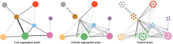
Correlation and regression are important for multivariate data analysis. Correlation information is typically visualized by scatterplots, while regression is represented through dot-line glyphs in scatterplots. However, scatterplots are unable to show correlation information involving more than two attributes. To address this problem, we studied the indexed points in parallel coordinates, i.e., a point representation indicating linear relationships (linear correlation + regression) and proposed a novel visualization method that shows indexed points on top of polylines in the image space of parallel coordinates. As shown (Figure 4.), indexed point parallel coordinates visualization is able to show local linear relationship for three attributes that cannot be visualized in scatterplots.

- Figure 4: Indexed point parallel coordinates visualization showing local relationships of subspaces of three adjacent attributes of a multivariate dataset (left). By brushing-and-linking, a planar feature is found within the space formed by attributes “speed”, “height’ and “temperature” (right).